Today I am taking an in-depth look at the new watercolors from the Jane Davenport line of mixed media products from American Crafts sold at Micheal’s craft stores. Oh, before I forget I am doing a surprise live stream today at 10am Eastern Time on YouTube showing the little blue bird I painted in my sketchbook. I will make the replay available later if you can’t make it live but if you have questions about the paint you can ask me at that time!
Disclaimer: This is a review, I bought these supplies with my own money and I was not asked to review them by the manufacturer, nor, was I compensated to. As always these opinions are my own and are not endorsed by American crafts or Micheal’s craft stores.
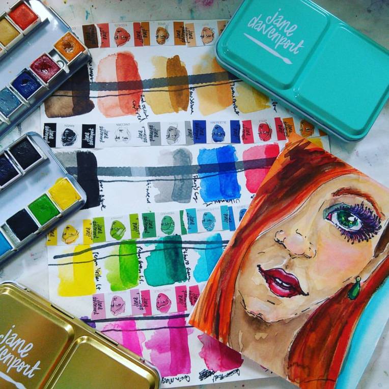
I am reviewing the two watercolor sets available in this line, the Brights and Neutrals. Pigment information available on Jane Davenport’s website. I was unfamiliar with some of the pigments used in this paint but “The Spin Doctor” posted an analysis of the pigments from the Brights set on his blog yesterday (he plans to post info on the Neutrals today) that you might find helpful.
First a quick overview of each set:
Brights:
- 12 vivid transparent colors with cool undertones in a pretty teal blue metal tin. 8 out of the 12 colors are single pigments. Both best friend and Fairytale feature the pigment only as PR81 which is Rhodamine 6G, the Rhodimine die BV10 is what is added to Opera to give it its fluorescent glow, I wonder if additional BV10 might have been added to “best friend” to give it that punch, it is a pigment that does not need to be listed on a label, just like PW4 if used as a filler. I suspect if exposed to prolonged daylight “Best Friend” will deepen to the “Fairytale share” There are also 2 mixed colors that can be made from the other pigments in the set (70s eye shadow and jimminy can be mixed with the blue, green and yellow in this set.) That said these paints are marketed to artists that might not be interested in mixing colors and would rather have the convenience colors. To make this a more versatile set you could add a warm red and brown paint. The colors in this set mix very well and yield clear bright mixes. Skin tones are possible with 3 and 4 color mixes. This set is perfect for flower painters.
Neutrals:
- 6 out of the 12 colors are single pigment colors. The primaries in this set yield warm oranges, and muted plums and greens. This set contains many convenience skin tones. This set is ideal for quickly coloring in people and portraits for people who don’t want to mix colors. All of the colors have warm undertones but the red is fairly neutral so you can pink up cheeks in a portrait without it going too orange. 2 colors are redundant (buff and dove) as they can be made from colors in this kit. For versatility I’d add a cool red and pthalo green. Personally I don’t care for the black, white and grey in this set as I don’t often use those colors but this is geared to more of a graphic style of art and I think more crafters would appreciate them. These colors are semi transparent. This set comes in a brushed gold tin and would pair well with the bright shades of the mermaid markers or the other watercolor set.
Price: $29.99 (you can save 30%-60% with a coupon from Michael’s)
Bottom line, I think for the money they are a nice paint and I would place them among the same quality of Sonnett, Prima* or Koi* but bonus points that pigment info is provided for the Jane Davenport paints. I think they are nice quality and definitely with the money on sale:) These colors glaze and lift well. I am happy I bought them.
How do Jane Davenport paints compare with Prima Marketing Color Confections? Well, what do you want to paint? Both the Jane Davenport and Prima paints have specific palettes for specific themes. Get what you like! The tins are nearly identical and the paints do indeed seem similar but after comparing them side by side I found some colors overlapped and some did not. Perhaps they are made by the same factory (it is a common practice for media products to be private labeled overseas by the same factory) but I can’t say for sure. The texture of the dry paint was similar to the Pastel dreams Prima set but the Jane Davenport colors were more transparent and bright save for the light skin tones.
If you have any questions about this paint join me for the impromptu live stream today at 10am on YouTube and you can ask your question. I will take Q & A after the demo and I will leave that in the replay so you can see what others asked in case you can’t make it. Thanks for stopping by and til next time happy crafting!

What are the pretty bejeweled pieces on the screen before you hit play on this video? They are lovely!
LikeLike
they are bubble wands:)
LikeLike
Just checking to see when teh Gloves in A Bottle winner will be announced! My poor, chapped and bleeding hands are praying that it is me! Thanks in advance for you help!
LikeLike
Hi Barb, the winner was Henry Rodriguez, I send his email over to the sponsor to ship the prize. I didn’t have the chance to announce it but we always contact the winner:)
LikeLike
Hi, I have watched several of your watercolour demos…love them! In the blue bird one, you mention a website you use for pictures that are copyright free. Can you please tell me the name of it. Thanks so much! Rhonda
Sent from my iPad
>
LikeLike
https://pixabay.com/
LikeLike
I totally enjoyed your review of the Jane Davenport pan paints. Thank you for taking the time to do such stunning and honesty work. I have learned so much and my paintings are so much better. Thank you.
LikeLike
Could you hold off on Live painting Fri. Until after the president is sworn in ?
LikeLike
I love your bird painting and want to purchase the sets at michaels…the pans remind me of the prima water colors that I like would you call them 1/2 pans or pans.
LikeLike
I like! Printed out reference, can’t wait to try. I also joined pixabay, boy between that and pmp, I will never run out of references again. You are the best.
LikeLike