Hi friends! The fall foliage is in full swing in Maine and we spent the weekend out in nature soaking up as much of the color as we can! I was inspired by the colors to create this watercolor tutorial for you.

I thought it was a great excuse to try out some new watercolors! Watch the video to see what I think of them and see my spooky new DIY paint palette;)
Video!
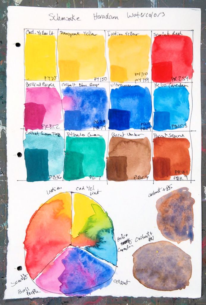
I am using the Schmincke Horadam Watercolor paints. I am using: Ultramarine, Brilliant Purple, Scarlet Red, Cadmium yellow light, Helio Cerulean and Burnt Sienna. I am also trying out the new ZEN dagger brushes from Royal & Langnickel I picked up this weekend.
Big thanks to sweet viewer Christiane who reached out to Schmincke on my behalf because she heard me talk about how I would love to try their Horadam watercolors. They generously sent me 12 tubes to test out. Thanks to you both!
I also received 6 other colors to try out. I was really impressed with the strength and granular properties of these paints. They reminded me a lot of Daniel Smith Watercolors. Here is a swatch so you can see the 12 colors I received. The big squares were a wet in wet wash and the darker squares are a glaze applied on top.
Pros:
Bright vivid colors
Unique characteristics from color to color, nice granulation in some
High Quality-Artist’s Grade
mixes well
Cons:
Price is higher than many brands
Some funny mixes, the ultramarine was PB15 + PB29 instead of just PB29 and Burnt Sienna was PR101+PBk9 instead of PR101 or PBr7
Harder to find than other brands in the USA
Paints take a long time to dry out in a palette, I would probably purchase pans in the future because I prefer to work from dry pigment
Bottom line, I recommend them, I have been a fan of Schmincke pastels (my favorite pastels actually) and their watercolors do not disappoint. I received these paints from Schmincke for the purpose of this review and I think I will probably purchase some others in the line, probably pans because the paint squeezed from tubes take a long time to dryout.
You can find out more about Schmincke paints on their website.
Reference photo by Shanna Leigh at Paint my Photo. https://pmp-art.com/shanna-leigh/gallery/165595/thy-happy-place (you might need to copy/paste the link, I am not sure why it won’t link.)
I took some foliage photos while out in the kayak Saturday, I hope you are in the mood for a few more fall landscape tutorials:) Thanks for spending some time with me today and til next time happy crafting!

This painting just draws you in. It’s beautiful.
LikeLike
I started out with Schmicke because it’s easy to get here in Germany and it’s a reliable brand. But I didn’t like the opaque and chalky colors like burnt sienna, so I gradually replaced lots of the pans with W&N’s. Their burnt sienna is far nicer and I also like W&N’s “gold ocher”.
But I still use some of the Schmincke colors, like Prussian Green is one of my favorite dark greens although it’s a mix of PG7 and Indathrone Blue, I think, but it’s convenient to have. I also use “Purpur Magenta” and “Rubinrot” very often for flowers. I could mix May Green too but as I use it a lot I kept it for very light parts of foliage. I know a lot of people who use “Neapelgelb rötlich” for a thin strip of sky right above the horizon to give it some light and I must say it looks nice but I don’t care for the Titan whiite it contains floating on the top of my water getting into the other paint pans gradually. I’d have to use a separate paint brush and water for that color.
You can check the pigments on their site, BTW, and print it if you want to:
Click to access HORADAM_AQUARELL_D_GB_150922_web.pdf
LikeLike
P.S.: I use Ultramarine No. 494, it only consists of PB 29.
LikeLike
Stunning painting!
LikeLike
Lovely painting. If have a couple of Schmincke watercolors, Translucent Orange and Burnt Umber. I like them. Jerry’s Artarama carries the full line of Schmincke watercolors. They are more expensive than other good brands.
LikeLike
Oh I love this one. Can’t wait to try it.
BJ Nichol
Sent from my iPhone
>
LikeLike