Hi friends! I get asked about color theory a lot so today I decided to show you how I mix colors and tell you what 6 colors I recommend for watercolor but it can be applies to any paint medium. I also recommend white if painting in acrylics or oils.
I even have a free printable handy-dandy checklist of supplies for watercolor here. Now, watch the video to see the color mixing magic happen!
Video!
Trust me, play with your paint and start mixing. Watching a video is good but you will learn by doing. Your color may have different names or maybe your color are in pans and you do not have the names BUT you do have eyeballs so simply look at them and see what the undertones are in your primarys.
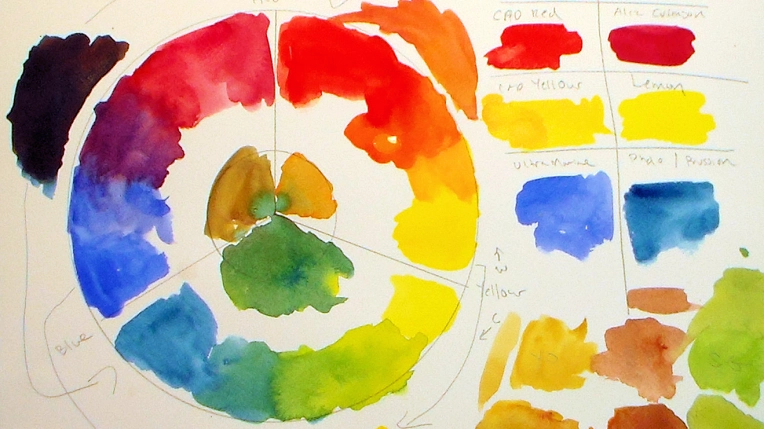
Red
Warm: Cadmium Red, Scarlet, Vermilion (any red that looks more orange than purple)
Cool: Alizarin Crimson, Quin. Magenta, Red Rose Deep (a red more purple than orange)
Blue
Cool: Pthalo, Prussian, Turquoise (A blue more green than purple)
Warm: Ultramarine, Cobalt (a blue more purple than green)
Yellow
Cool: Lemon (a yellow more green than orange)
Warm: Gamboge, Cad Yellow, Indian Yellow (A yellow closer to orange than green)
Once you can spot the colors undertones you will know what paint to pick for mixing the color you want.
I also like Sap Green, Yellow Ocher and Burnt Sienna because I use a lot of these colors and it would take a lot of time to mix these (although you totally can) on every painting. Play with the paint, it is the best way to learn. My dad always said the best way to learn how to build a house is to build a house. It’s the same with painting (and he was a contractor and I am an artist so you can totally trust what we say!)
I hope are less confused about color now. Thanks for stopping by and til next time happy crafting!

Oh boy! I thought I was pretty good with colors, but I was thinking the blue with more purple was the cool blue so maybe not so much. A blue with green seems warm to me because of the yellow in it. Argh, guess I need to rethink blue!
LikeLike
Wow, you took me back to High School! I had forgotten how much fun color mixing is.
LikeLike
It was very interesting to see how you mix Sap Green, Yellow Ochre and burnt Sienna. Would you believe the other day I put the primary colours (6 of them) into an empty tin to take out with me to try out mixing all my colors?! I WAS quite concerned how to mix the missing colors I need badly (Sap Green, Yellow Ochre and burnt Sienna!!) but now I know how to (at least theroretically …). I THINK I can get Indigo by mixing Prussian Blue and burnt Sienna. Can you tell me how to get something like Paynes Gray or Indanthren Blue?
LikeLike
indigo: prussian blue with a touch of cad red
(add more red for paynes grey)
Indanthren Blue is very similar to prussian and you cand use that if you wanted to as a primary I think:)
LikeLike
This is just what I needed! Lindsay! thanks so much, sent you a little (yep a little message rather than long posts) on fb!
”Sorry” i tend to type like i talk waay to fast! LOL for art is really helping my endometriosis pain! it’s bringing such fun and creativity.
LikeLike
Great video Big help.
LikeLike
Nicely done! Simple and easy to understand. Thanks.
LikeLike
Lindsay,
Can’t print the watercolor supplies list.
LikeLike
Lindsay, how do I download one of your PDFs files?
LikeLike
Sorry Lindsay, my husband bailed me out. I got the PDFs file printed. Thanks
LikeLike
I so enjoyed this videos. I learned so much. Thank you very much, I even made a copy for my personal use 🙂
LikeLike
Hi Lindsay, I am a true follower of yours and I have learned so much over the past year and a half since I picked up watercolor! I have a question, though, on your latest color mixing theory video. I always thought that the color wheel was well balanced: top right (from cad red to cad yellow) warm colors, top left (from magenta to ultramarine) cool colors and the bottom section ranging from warm (Prussian blue) to cool (lemon yellow). Now you have me all confused. To me it doesn’t make sense that a blue leaning towards green is called cool, whereas a blue leaning towards purple is called warm. Isn’t it the other way around?
LikeLike
there is a lot of debate about that but if you look at both of the bluse the one that is more violet looks warmer to me ad the one with more green looks cooler, both blues are adjacent to cool versions of b=primary, really they are both cool colors. Look for undertones rather than warm and cool and you can’t go wrong. Oh and the colors could go either way round the wheel, you still mix them the say way and they are still adjacent to the same colors. try it, you’ll see:)
LikeLike
Thanks, you are right about the undertones. Good tip!
LikeLike
That has really helped Me with colour theory do you have any advice for watercolour paints for a Beginner at present I only have a Kids set of watercolours they work great and I use it a lot was wondering if i should go to the supply art shop and get myself some more
I heard you say ”Derwent are great”
Reeves I do know they sell, what’s your view on that brand??
thanks Lindsay! 🙂
LikeLike
derwent is a great pencil maker, I don’t think they have paints. Reeves is a good student set, the next step up would be cotman by Windsor & newton and they the artist’s quality paints. You can try different brands as they all will work together. and just replace paint you like with your favorite brand as you run out so there is no waste. I favor M Graham for quality and value and I like how it stays fresh in the palette when you squeeze it out.
LikeLike
Thank you!!! This is one I need to watch over a time or few! It’s amazing what colors do!!! I just love it!
LikeLike
Thanks Lindsay, for your comment about the brands appreciate you writing and I am such a big fan of yours 🙂 PDF Files when I get my printer working will get some of those ‘learn to paint with Lindsay’
Also, just wanted to say, Your watercolour art supplies list was helpful too
🙂
LikeLike
This video was very helpful thanks Lindsay!!
LikeLike