Hi friends! Today I have a technique that I think will blow your mind! It is called Grisaille and it is an old technique usually done in oils. It is how Baroque and Renaissance painters got dramatic and realistic looks to their paintings. Today we are going to learn how to do it in watercolor!

I have a lot of tips for success in this blog post so please read through before you begin to avoid any problems. You don’t want to spend a ton of time on your grey underpainting only to find your paint lifts for instance.
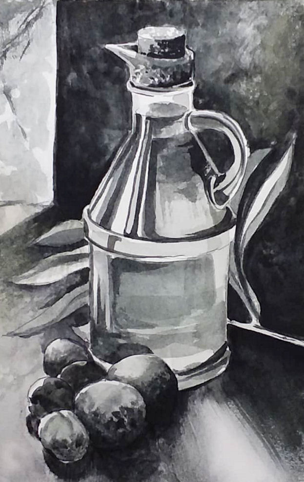
Grisaille is a French term that means to paint in monotone. You can paint in grey, brown or a grey green depending on the look you want. I am using QoR’s Neutral tint watercolor for several reasons: #1. A viewer requested a tutorial with it. #2. I had it from the 24 QoR set I recently purchased and I never thought I’d use it but I didn’t want it to go to waste and the most important reason #3. As luck would have it it’s the perfect neutral gray and it resists lifting so I don’t have to worry much about reactivating it while I glaze my color on top. Please refer to the photo of my grey underpainting below as you create your grisaille underpainting.
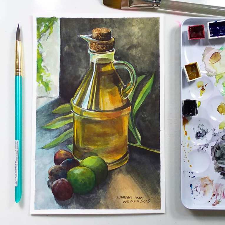
After your underpainting is dry you will be glazing (glazing means to paint a layer of transparent color over a dry layer) color on top. The colors for glazing are:
- Permanent Alizarin Crimson-This is a transparent staining cool red
- Phthalo Blue (Green Shade) – This is a transparent staining cool blue
- Nickel Azo Yellow _ This is a chameleon of a color, when used thinly it has a cool greenish undertone but when used thickly it has a warm amber undertone, I have never seen a color to have such different color tones when used in different strengths. It is also very transparent which is quite odd for a yellow.
Here is the reference photo. You can download a larger version of this beautiful photo by Roberta Sorge on Unsplash for free. I chose this photo because of the dramatic lighting. This photo captures the Chiaroscuro effect perfectly. Chiaroscuro is an Italian art term referring to strong contracts between light and dark and you will often see the shadowed edges of objects just disappear into blackness (like the olives in this photo) if gives drama to a painting and adds volume and a sumptuous effect to a painting. This technique was favored by baroque painters and also used to depict dramatic religious scenes by Renaissance painters. Don’t you feel smart now?

Please watch the video for the full tutorial. This will be broadcast live at 12:30pm eastern time on 7/27/18 so tune in on YouTube if you want to ask questions as we go along. The replay will be available after the livestream as well. This technique takes time so don’t be discouraged if you need to take a few sessions to complete this or rest your eyes along the way. Enjoy the challenge of learning something new!
Supplies available at sponsor Jerry’s Artarama! Use coupon code: frugal20FS49 for 20% off $49 + Free Shipping (Excludes: Sale, Super Sale, Egift Cards, Buy It Try It’s and Vendor restricted items. Look for the green coupon eligible icon on the product listing.
Supplies:
- QoR Watercolors (colors can be bought individually or in the 24 color set with many other useful colors I recommend) Neutral Tint, Permanent Alizarin Crimson, Phthalo Blue (Green Shade), Nickel Azo Yellow
- Brushes: You want soft brushes for the color glazing such as the Mimic squirrel brushes in a variety of sizes. For the grisaille layer using neutral tint you can use whatever brushes you prefer. If you are not using QoR neutral tint be sure to test your “black” on the paper you plan to use for lifting as you want a staining color that is hard to lift. If you do not have a non lifting black watercolor use a non shellac waterproof black ink. ***Important! You will also want a soft blunt round or filbert (aka mop brush) that will be used dry for blending and mottling color. Do not rinse this brush while we paint, it is to remain dry for the duration of the painting and then you can clean it. A mimik filbert will be good for this or any small soft mop you have.
- Paper: I recommend the Aquabee #140 6″x9″ cotton watercolor paper I usually use for tests or try the Fabriano Artistico 7″x10″ test pack for $2.25 at Jerry’s because these paper will not lift as much as other more heavily sized paper. Plus it’s a good deal!
- Pattern to trace
Tips for trying this with other subjects.
- Learn the process by working step by step through this project so you know how to apply the layers before striking out on your own.
- Take (or choose) a photo with strong lighting and high contrast between lights and shadows.
- If you struggle seeing values (values means how light or dark something is) then desaturate (make grayscale) your photo in your computers image editing program to make it a black and white photo and it will be easier to work with.
- Make sure whatever you use for your underpainting does not easily lift. Test your paint and paper before you begin so you don’t end up with mud when you glaze.
- Use very transparent paint and soft watercolor brushes for glazing color.
- Keep a couple soft dry brushes on hand for diffusing, blending and softening colors. Think of this process like hand tinting a black and white photo.
I get asked a lot about shading and value when I am watercolor painting. if you would like help with learning about values and drawing what you see accurately my online class Learn to Draw with Lindsay focuses on just that. I know many people have no interest in learning how to draw and that’s fine (that’s why I provide patterns for many of my painting tutorials) but if you want to be able to draw without gimmicks and train your eyes to see shade and values accurately please consider checking out this course:)

I hope you enjoyed this lesson that combines art history with classic technique. Pat yourself on the back if you painted along, it is probably the most advanced technique I’ve done on a free live friday watercolor lesson! If you would like to see more techniques like this let me know and please share this tutorial with a friend or on social media or pin it on Pinterest! Long in-depth tutorials don’t do well on YouTube so please share if you care! Thanks for stopping by and til next time happy crafting!


YES – I would love this kind of tutorial. Not a big fan of loose painting though. Can’t wait for the live telecast and just Pinned it. Thank you
LikeLike
this is very interesting and I discovered I like doing this sort of thing but with layering different colors. There was an artist who I can’t recall his name but he mastered this. You paint so beautiful.
LikeLike
Anna Mason uses the same method with colors.
LikeLiked by 1 person
yes I want to see this.
LikeLike
I want to private message you but cannot find of yours. Mine is zarina.craft@gmail.com
LikeLike
oh
LikeLiked by 1 person
there should be an email address on my contact page.
LikeLike
could not find an email address so I used the form for messages
LikeLike
Would love to be able to download your video to my ipad so I can take it with me outside…(think campgrounds without WiFi)
Is that possible?
LikeLike
Can you email me at vtuckerbusiness@yahoo.com with contract information to discuss possible private lessons? Thank you.
Victoria
LikeLike
Hi Victoria, I currently do not offer private lessons.
LikeLike
that is just beautiful…I did some underpainting in university and loved the effect!
LikeLiked by 1 person
Thanks for keeping things fresh and interesting Lindsay. You make painting so much fun!
LikeLike
Can use Inktense blocks for under painting as they are permanent once they dry!
LikeLike
Always exciting to learn a new technique, thanks so much!
LikeLike
I love this and want to try it!!
LikeLike
The pastel group in Paint my Photo has a challenge that runs through September of what they call a “mono-tonal underpainting” (any medium) and a pastel (pan, hard,mor soft) color final painting, for anyone who’s a member or is interested in joining. Great art community (as Lindsay knows!)
LikeLike
I have checked the discussion but there is still the limitation: the final color work has to be done in pastel. That definitely rules me out.
LikeLike
I just discovered a medium that might be useful for a tonal underpainting: water soluble oil pastels. When wet they function much like watercolor but once dry, are permanent. At least this is true of the Mungyo set I have, which at about $15 USD are quite economical!
LikeLike
Hey Lindsay,
I am in the middle of trying this out now and I just love the technique
Jen
LikeLike
I managed to get this patter but have had trouble getting some older ones. Ant suggestions?
LikeLike
Where can I find the paint palette tray you are using
LikeLike